Luxury Hospitality Brand Identity and Environmental Design for Hotel Verde


the brief
Hotel Verde is a self-initiated concept project exploring a specific hospitality design challenge: how do you build a brand system that feels genuinely botanical without becoming decorative?
The brief centred on an elevated retreat, a property where the natural world is part of the brand's identity, not just its aesthetic. Every guest-facing touchpoint needed to carry that philosophy without stating it explicitly.
Hotel Verde required a refined stationery system that translated the brand’s philosophy of An Elevated Retreat into tangible guest touchpoints. The brief called for a balance of botanical softness and contemporary restraint, ensuring each element, from letterhead to in-room materials, felt calm, intentional, and quietly luxurious.
The system needed to integrate seamlessly within the wider hotel experience while maintaining clarity, consistency, and longevity.
the work
The visual system was built around a botanical softness held in check by contemporary typographic restraint - deep forest greens, muted neutrals, and a delicate illustrative motif that appears across guest-facing print without ever overwhelming it.
Hotel stationery design lives or dies by the details: the weight of a door hanger, the finish on a letterhead, the hierarchy on an in-room card. Every element here was considered as a tactile object first.
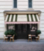
The system extends from environmental signage - where the identity needs to hold at scale across a physical space - down to the smallest printed collateral, with the same visual logic threading through each. The digital brand experience was designed as a direct translation of that physical language, not a reinterpretation of it.


DIGITAL EXPERIENCE
The website was designed as a direct translation of the physical identity, not a reinterpretation of it. The same calm, the same pacing, the same typographic logic. A guest who encounters the brand in print and then online should feel they never left the same world.

The Result
A complete hospitality identity that holds across every scale the brand requires, from a flag on a building exterior to the weight of a door hanger in a guest's hand. Botanical without being decorative. Restrained without being cold. The measure of hospitality design is whether it makes a guest feel they've arrived somewhere considered. This system does.