Winery Brand Identity Design: What Independent Wine Labels Get Wrong
- 1 day ago
- 5 min read

Walk into any wine shop and look at the labels. You will notice something quickly. Most of them are using the same vocabulary. A crest, or something crest-adjacent. A serif typeface with enough weight to signal tradition. A dark ground, usually deep burgundy or forest green or near-black. Occasionally an illustration of the estate, rendered in a style that suggests the nineteenth century even if the winery was founded last year.
This is not bad design. It is safe design. And in a category as competitive as wine, safe is its own kind of risk.
Independent wineries and wine labels that want to build genuine recognition, the kind that earns a second purchase and a recommendation, need to think differently about what their brand identity is actually doing. Not just on the shelf, but at the table, in a photograph, on a website, inside a gift box. The label is the smallest part of the problem.
Here is what most independent wine labels get wrong, and what a considered winery brand identity actually needs to do.
The Heritage Trap in Winery Brand Identity Design
There is a reason winery branding defaults to heritage aesthetics. Wine has centuries of visual language behind it, and borrowing from that language signals quality, craft, and seriousness to a category-literate customer. The problem is that every winery is borrowing from the same library.
When a customer scans a shelf, their eye is looking for a reason to stop. A label that looks like the twelve labels next to it does not give them one. And a brand that communicates nothing specific about who it is beyond "we also make wine" has no story to tell once it leaves the shelf.
"The wineries that build lasting recognition are the ones that find a way to carry the credibility of the category without being consumed by its conventions."
The wineries that build lasting recognition are the ones that find a way to carry the credibility of the category without being consumed by its conventions. That requires a deliberate decision about what to keep and what to leave behind.
The Label Is Not the Brand
This is the most common mistake independent wine labels make: treating the label design as the entire brand identity project.
A label is one touchpoint. A brand identity is the complete visual and verbal system that makes your winery recognizable and coherent across every surface it touches. That includes your label, but it also includes your packaging system, your gift boxes and tissue and shipping materials, your website, your tasting room if you have one, and the way your bottles photograph at a dinner table or in a flat lay.
When a label is designed in isolation, without a broader system in mind, what you typically get is a beautiful bottle that produces nothing when asked to do anything else. The label that looked composed and elegant at A4 scale becomes awkward at thumbnail size. The typeface that read as luxurious on the front label looks entirely different on the back label in a smaller size. The color that photographed well under studio lighting reads differently in a restaurant.
A winery brand identity designed as a system solves these problems in advance. Every element has a logic that holds across scale and context.

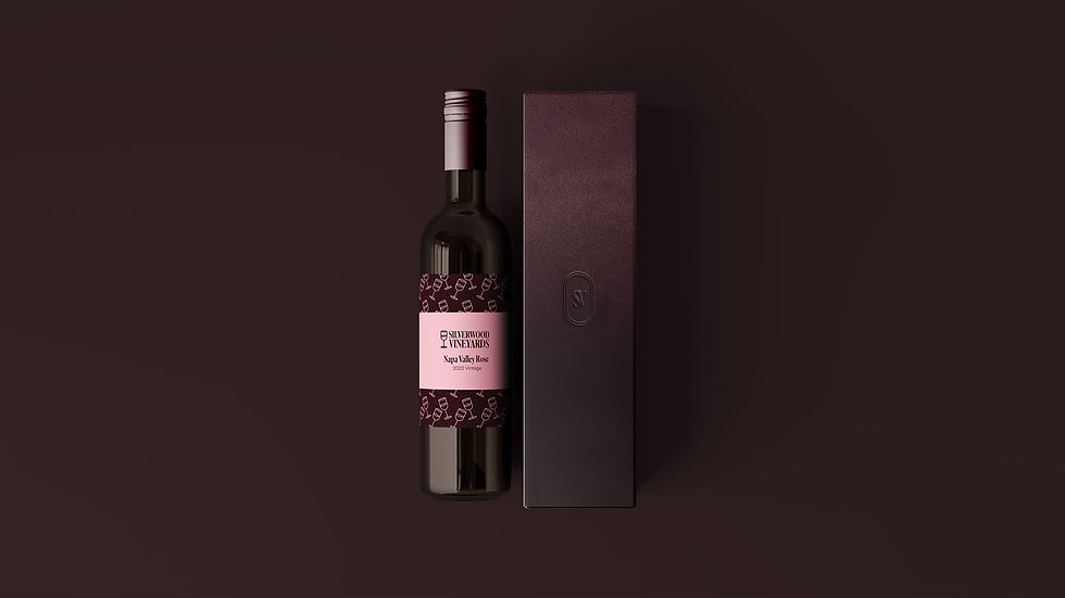
When the Silverwood Vineyards identity was developed at Studio Ruby Signorelli, the palette deliberately moved toward blush and pale neutral tones rather than the dark grounds that dominate the category. That was not simply an aesthetic choice. It was a considered decision to signal a lighter, more modern sensibility while retaining the restraint that premium wine demands. The result was a label that reads differently on a shelf full of dark bottles, a packaging system that photographs cleanly in natural light, and a gift box presentation that feels considered rather than generic. Every label in the range shares the same structural logic, so the collection reads as a coherent family rather than a set of individual designs.
That is the difference between a label and a system.
Coherence Across the Range
Independent wineries with multiple varietals face a specific design challenge that single-product brands do not. Each wine needs its own identity, enough to be distinguished from the others in the range, while still belonging unmistakably to the same house.
The most common failure here is over-differentiation. A winery introduces a new varietal and decides to give it a completely different visual treatment, a different color, a different typeface, a different illustration style. The thinking is usually that the new wine should feel special or distinct. What it actually produces is a brand that looks like several different wineries sharing the same name.
The right approach is a shared structural logic with controlled variation. The same typeface system, the same label architecture, the same quality of material finish. Color and secondary graphic elements can vary by varietal, but the bones of the system stay consistent. A customer who picks up your Rosé and your Cabernet should immediately understand that they come from the same house, and feel that both are worth their confidence.
What Modern Wine Buyers Are Actually Looking For
The wine buyer in 2026 is different from the wine buyer of twenty years ago. They are more likely to make purchasing decisions based on visual discovery, a photograph on a restaurant table, a recommendation in an Instagram story, a gift that looked beautiful in an unboxing video, than on a review in a specialist publication.
This changes what a wine label needs to do. It needs to be photographable. It needs to hold up at the size of a phone screen. It needs to look as considered in natural light as it does under retail lighting. And it needs to tell enough of a story at a glance that a buyer who has never heard of your winery feels confident enough to reach for it.
None of this requires abandoning quality or craft. It requires thinking about where and how your wine is discovered, and designing a brand identity that performs in those contexts.
The Question Independent Wineries Should Ask Before They Brief a Designer
Before you begin a winery brand identity project, there is one question worth answering honestly: what do you want someone to feel the first time they see your label, before they know anything else about you?
Not what you want them to know. What you want them to feel.
The answer to that question is the brief. Everything else, the color palette, the typeface, the label architecture, the packaging system, follows from it. A designer who begins with that question, and who treats the answer seriously, is building something that can carry your winery for years. A designer who begins with a mood board is building something that might look good on a screen.
Independent wine labels that earn recognition are the ones whose brand identity reflects something specific and true. Not the category they belong to. Themselves.
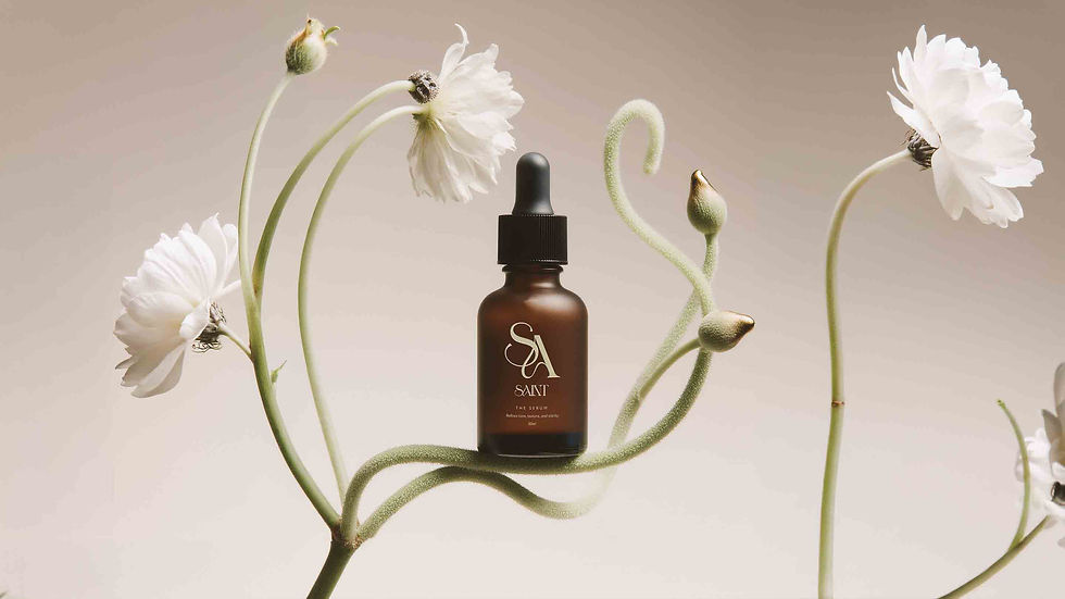
Studio Ruby Signorelli is an independent brand identity and packaging design studio based in California, working with independent luxury and premium consumer brands across skincare, beauty, fragrance, wine, and hospitality. Minimum project investment starts at $5,000. View our work or get in touch at rubysignorelli.com.